Jesmah Furniture
Brand identity for Jesmah Furniture: a J drawn like a chair in profile, an olive and rust palette, and a system for tags, print and packaging.
- Brand
- Jesmah Furniture
- Year
- 2026
- Role
- Brand identity: logo, color, typography, pattern and applications
- Tools
-
-


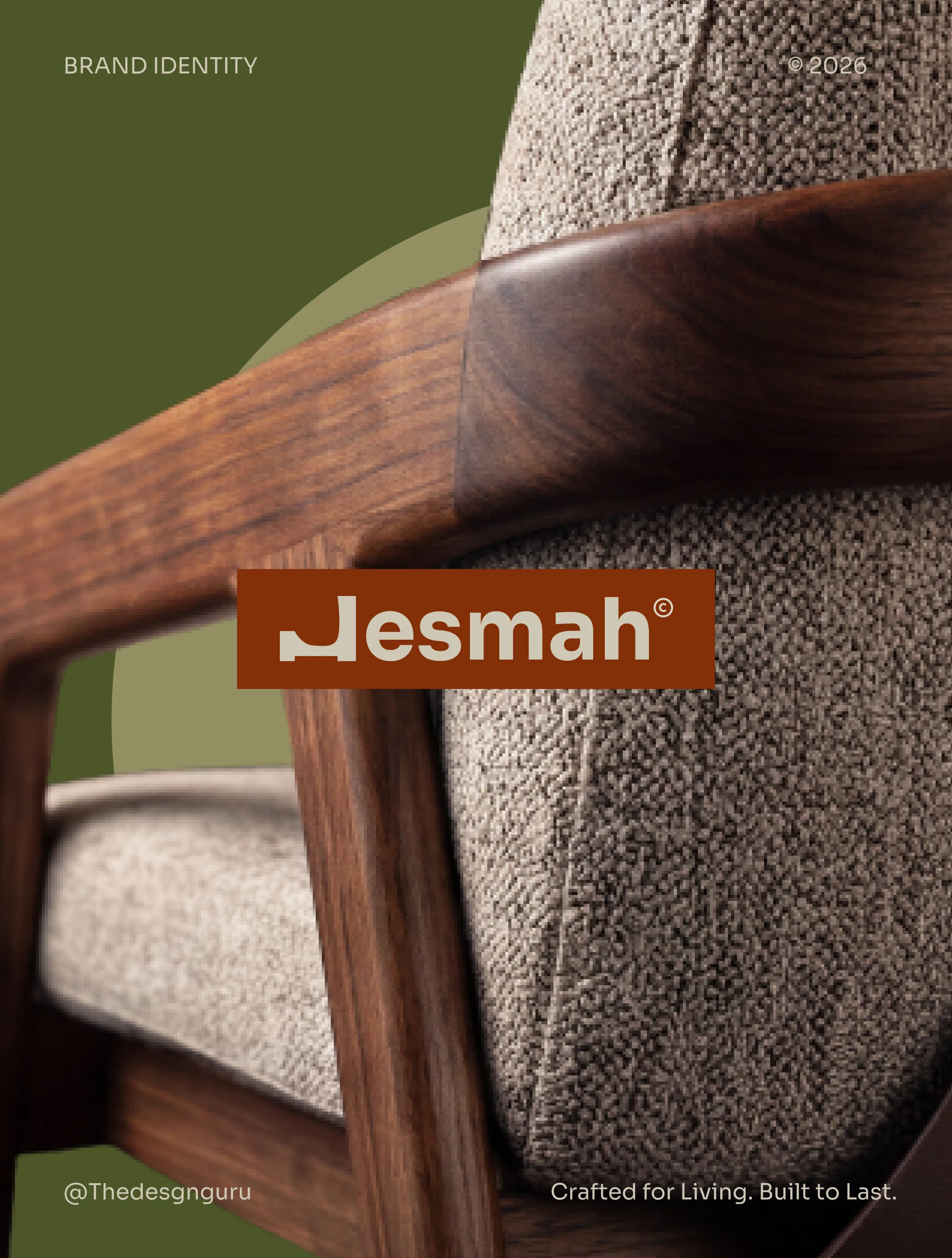
Overview
Jesmah Furniture is a subsidiary of Jesmah Group that makes furniture, with roots going back to 1994. I designed its brand identity: the logo, palette, type, a brand pattern and a set of applications from product tags to shipping boxes.
The challenge
The brand stands for quality, durability and functional design, and the identity had to say that before anyone reads a word. It also had to work at very different sizes, from a fabric tag on a seat back to the side of a box.
Approach
- I built the mark from the J. Its stem rises like a chair back, and a curve set from two circles turns the base into a seat on two short feet. Beside the wordmark it reads as a letter. On its own it reads as furniture.
- The palette comes from the materials: olive green leads, with sage, warm cream, near black and a deep rust. I tested the icon and wordmark on every one of them. Type is set in Sora, a clean geometric sans that sits well next to the heavy wordmark.
- The icon repeats into a tight brand pattern, and the lockup pairs the icon and wordmark with the tagline "Crafted for Living. Built to Last."
- I carried the system onto fabric tags, swatch labels, a spec sheet, a catalog spread, package tape, shipping boxes and woven product tags. Imagery pages set the tone: walnut frames and textured upholstery on dark studio backgrounds, and warm, sunlit rooms in olive and rust.
Identity
A J that sits like a chair
The mark and its construction, the palette, the logo on every brand color and the type.
System
Pattern, labels and print
The icon repeats into a pattern and moves onto fabric tags, swatch labels and a spec sheet.
Imagery
Studio shots and sunlit rooms
Dark studio frames for the product, warm daylight for the lifestyle side.
Applications
Catalog, tape, boxes and tags
Outcome
A complete identity system: logo suite and construction, color and type specs, brand pattern, imagery direction and applied mockups across print, product and packaging.
Next project