Jesmah Foundation
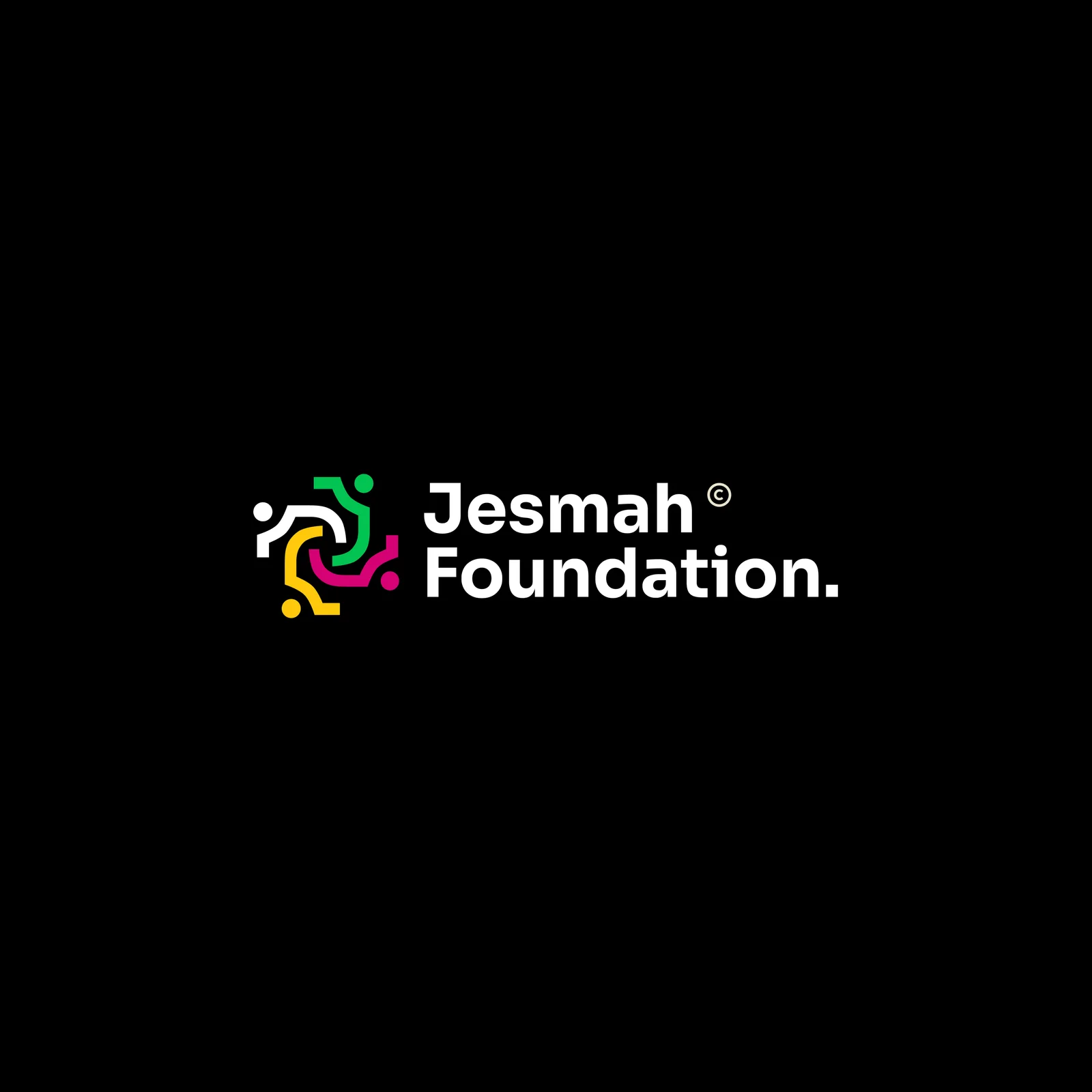
Brand identity for Jesmah Foundation: four figures turning around one centre, a bold four-colour palette and a full kit of community merch.
- Brand
- Jesmah Foundation
- Year
- 2026
- Role
- Brand identity, applications and imagery direction
Overview
Jesmah Foundation works under the line "Inspiring Change, Impacting Lives." I designed its identity: the mark and wordmark, a four-colour palette, a brand pattern and type, then carried it across merch, stationery, event kit and imagery.
The challenge
A foundation's mark has to feel human and hopeful at a glance. It also has to hold up at very different sizes, from an app icon and a rubber wristband to the roof of an event canopy.
Approach
- The mark is four figures, each a dot for a head and a bent stroke for a body, turning around a shared centre like hands joined in a circle. It works in full colour, in a single colour and reversed out of black.
- The palette is purple (#4B0CDF), green (#03C352), magenta (#D60175) and lime (#E2FF8C). I used them as big flat fields so every application reads from a distance, and cropped the mark's strokes large to make the brand pattern.
- Type is Sora, the same family used for Jesmah Furniture, set heavy for the wordmark and clean for supporting text.
- Applications cover community merch and event kit: wristbands, drawstring bags, bottles, a backpack, totes, caps, tees, a notebook, packing tape and a branded canopy. For imagery, I drew simple white line illustrations over documentary photos, sketching in a toy, sandals, gloves and a slate.
The mark
Four figures around one centre
Full colour, single colour and reversed out of black.
Colour and type
Purple, green, magenta and lime
Applications
From wristbands to a full canopy
Imagery
Line drawings over real moments
White illustrations sketch in a toy, sandals, gloves and a slate.
Outcome
A complete identity system: logo suite, palette, type, pattern, merch and event applications, and an imagery approach.
Next project